Seeing Edinburgh in Colour
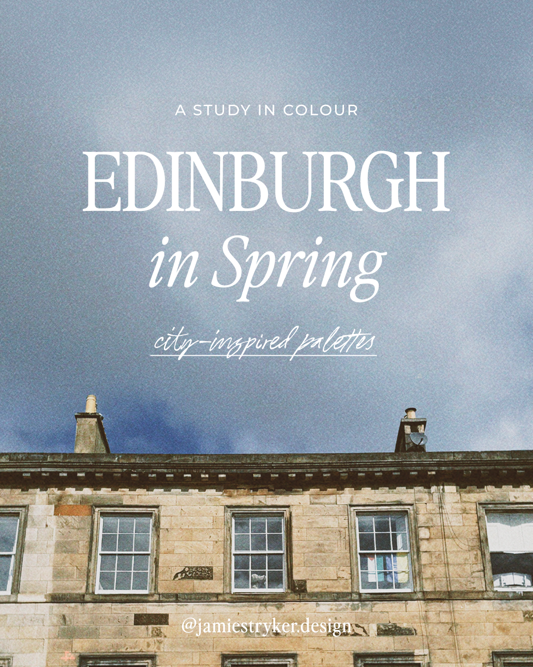
There's a particular quality of light in Edinburgh in spring. It's not warm exactly — it still has that northern edge to it — but it's golden in a way that catches you off guard after months of grey. I started noticing it properly this year, the way the city holds colour differently when the sun comes out: the amber sandstone, the painted shopfronts, the bright yellow daffodils in the squares.
I'm a graphic designer, and colour is one of the first decisions a brand makes. So I did what designers do — I started extracting palettes.
This is an ongoing series of colour palettes pulled directly from Edinburgh locations near and dear to my heart. Each one is a place I visited, colours I noticed. Some are from businesses I love. Some are just corners of the city that stopped me in my tracks.
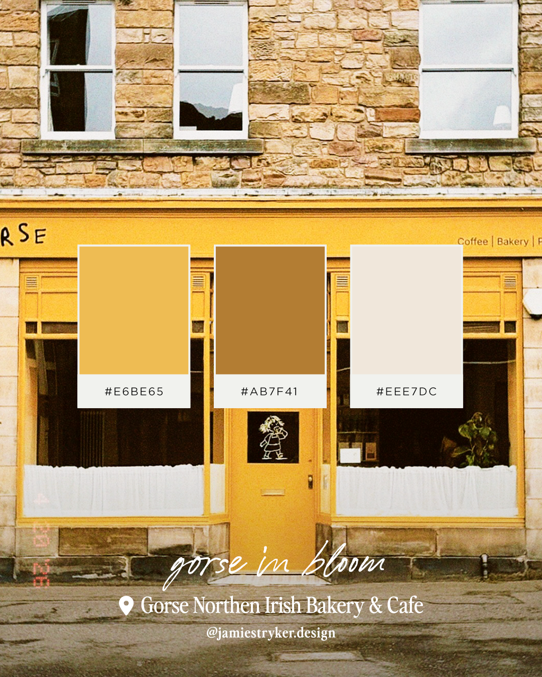
Gorse in Bloom
Gorse Northern Irish Bakery & Cafe — Pleasance
Gorse's new shopfront is impossible to ignore. That particular shade of amber-gold sits against Edinburgh sandstone in a way that shouldn't work but absolutely does. Up close, the palette is richer than you'd expect — warm honey, deep tobacco brown, and a soft cream that reads almost white in the morning light.
Exactly the kind of tone a hospitality brand reaches for and rarely lands on instinctively.
Gorse is a Northern Irish bakery and café on Pleasance - @gorseedinburgh
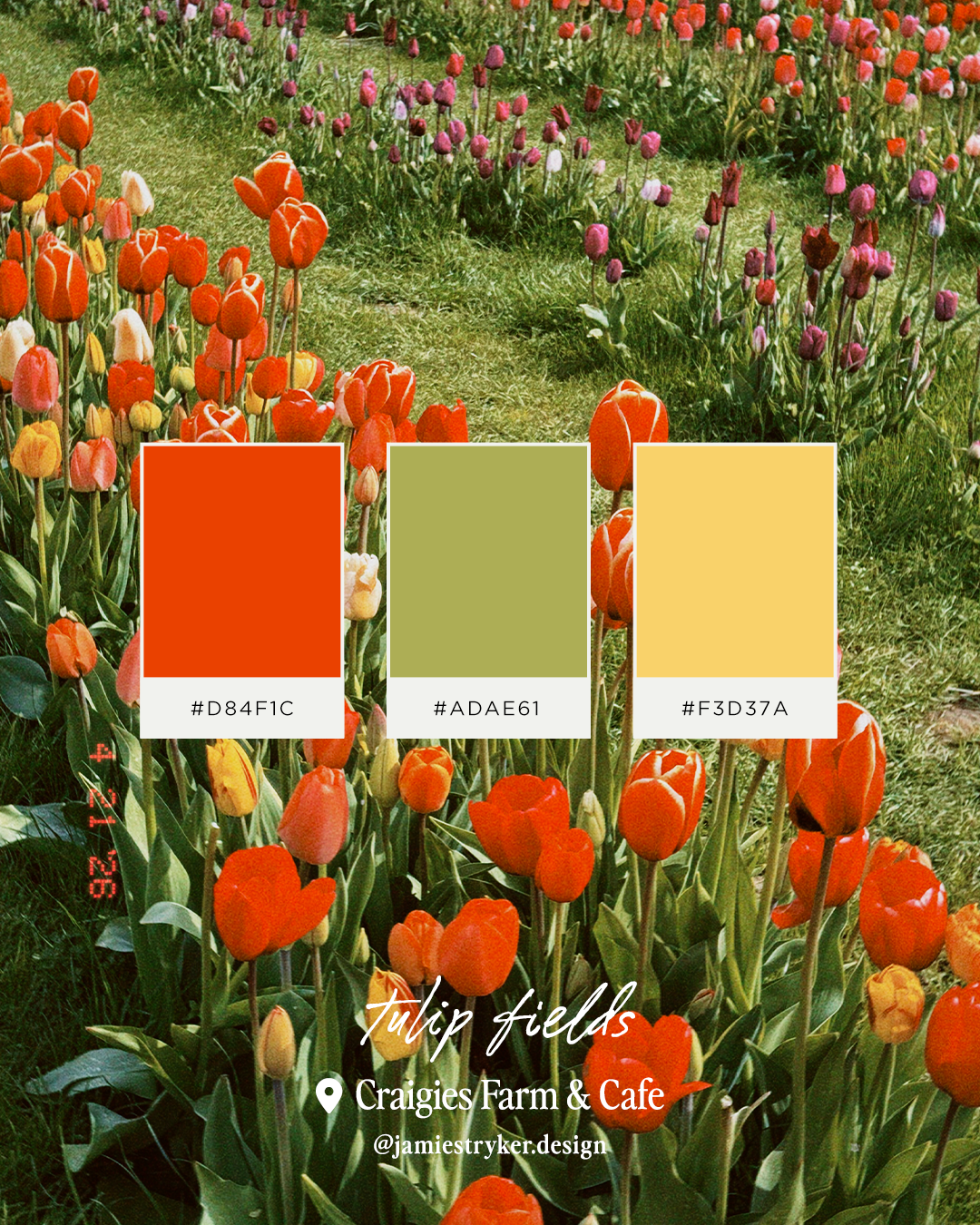
Tulip Fields
Craigies Farm & Cafe — South Queensferry
I was lucky to visit Cragie’s Tulip Festival this year; it was genuinely overwhelming in the best possible way — so many tulips in every direction. The palette I pulled here is unapologetically bold: poppy red-orange, bright green, eye-catching yellow. High energy and completely joyful.
Not every brand needs to be quiet and refined. Sometimes the brief is loud and alive, and this palette delivers exactly that.
Craigies is a working farm, deli, and café just outside Edinburgh, with a farm park and seasonal pick-your-own flowers in spring. craigies.co.uk
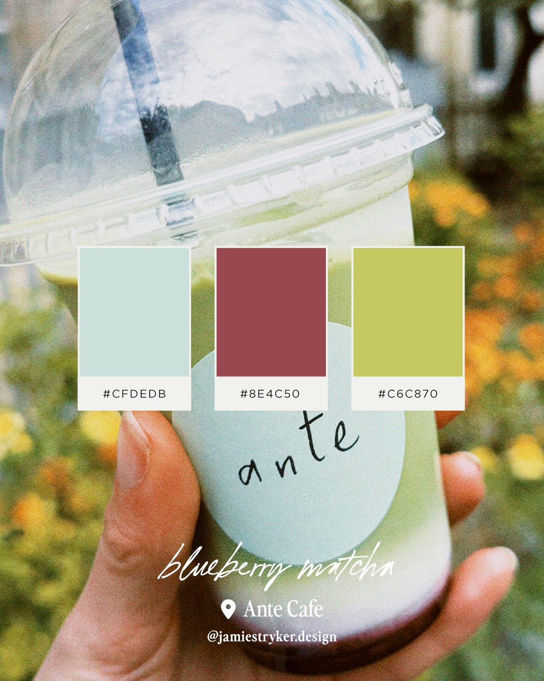
Ante Iced Blueberry Matcha
Ante Cafe — Haddington Place
I ordered the blueberry matcha mostly because it was beautiful. The palette that came out of it — pale mint, deep berry, olive green — is unlike anything I'd have chosen deliberately. Bold, unexpected, beautiful.
It's a good reminder that the most interesting colour combinations aren't always the obvious ones. The best brand palettes have a little tension in them.
Ante is a specialty coffee and bakery project on Haddington Place, from the team behind wine bar Spry. Known for exceptional pastries and inventive drinks. @antecafe
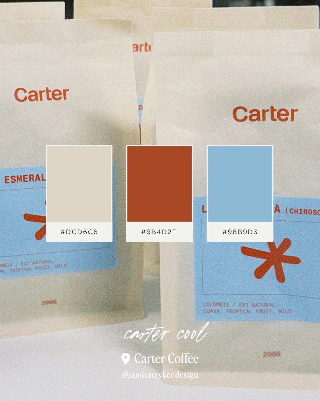
Carter Cool
Carter Coffee — Edinburgh
Carter's packaging is a masterclass in considered branding — that particular combination of white, terracotta red, and sky blue is distinctive without being shouty. It's a palette that catches the eye. Worth noting: the coffee is just as good as the branding.
This is what good packaging design looks like: you'd recognise it from across a room.
Carter Coffee is a specialty coffee roaster based in Edinburgh, with beautifully designed packaging and a serious approach to sourcing. cartercoffee.uk
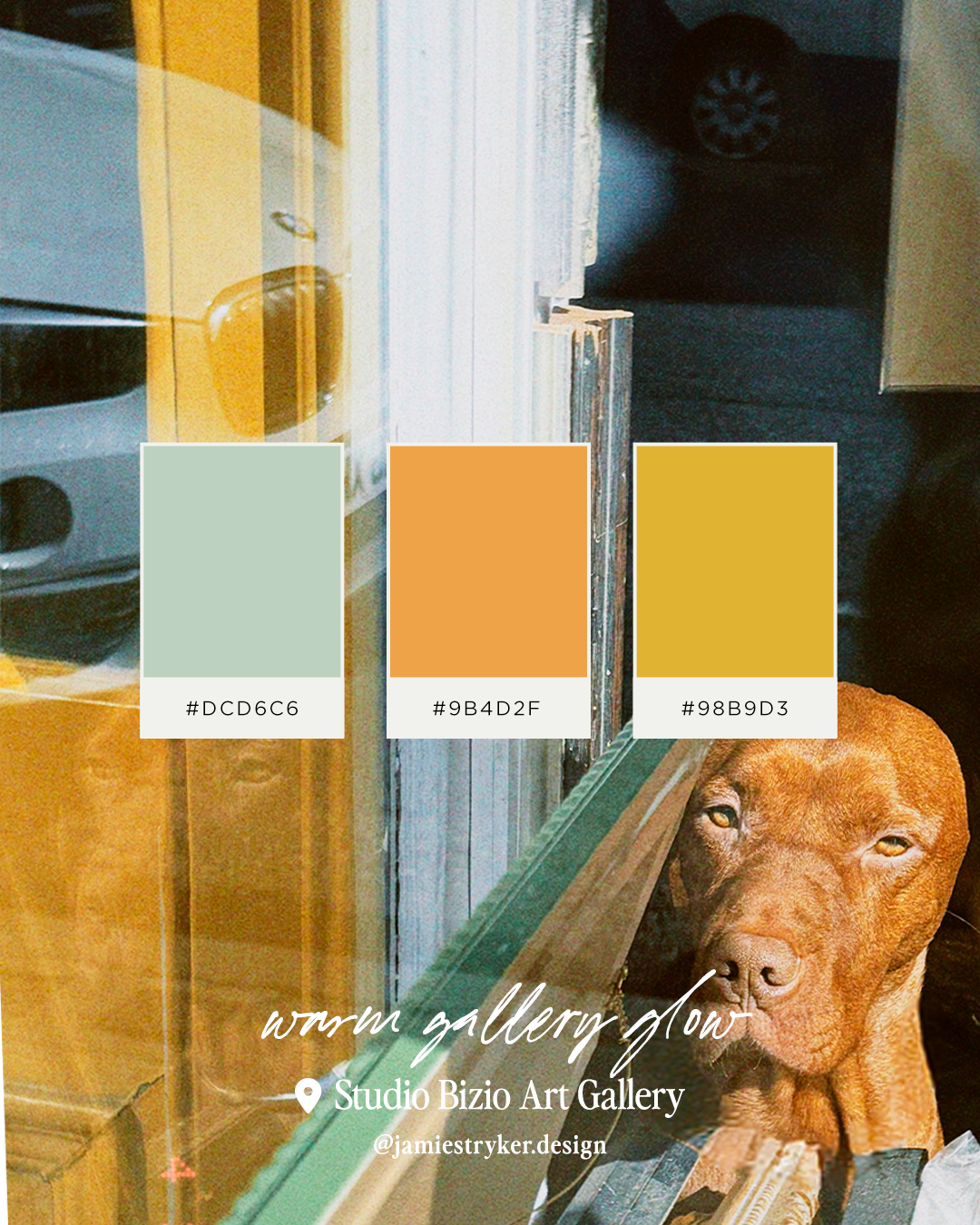
Warm Gallery Glow
Studio Bizio Art Gallery — Stockbridge
There was a dog in the window. That's how I noticed this one. But look past the very handsome Vizsla and the palette is quietly stunning; soft sage, burnt terracotta, and a faded blue. Warm and cool held in perfect balance.
Gallery spaces often get colour wrong, leaning too sterile or too dramatic. This one gets it exactly right. (Plus, who doesn’t love a gallery dog?!)
Bizio is a gallery on Raeburn Place in Stockbridge, specialising in 20th century and contemporary photography. studiobizio.com
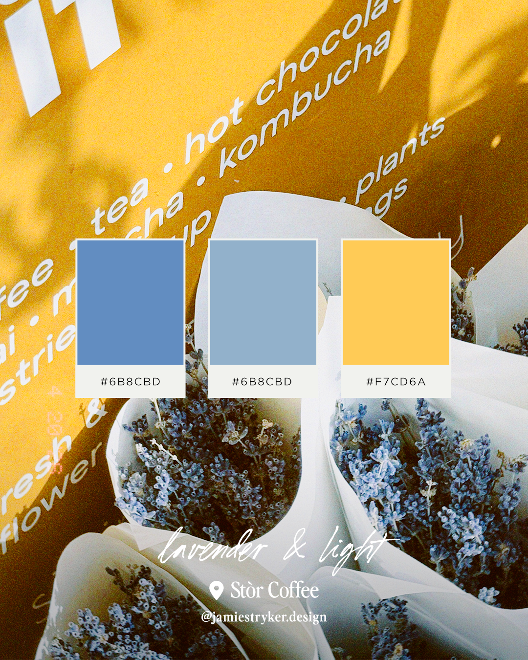
Lavender & Light
Stòr Coffee — Broughton Street
This one came from a bundles of dried lavender outside the shop, that dusty blue-grey against their signature golden yellow signage. An unexpected pairing that works because of the contrast: cool and warm, soft and bold.
The lesson here is that the most interesting brand palettes often come from pairing things that shouldn't go together. This one could anchor a wellness brand, a florist, or a food producer beautifully.
Stòr is a coffee shop and lifestyle space on Broughton Street, known for its flowers, plants, and beautifully considered interior. stor.scot
Make it stand out
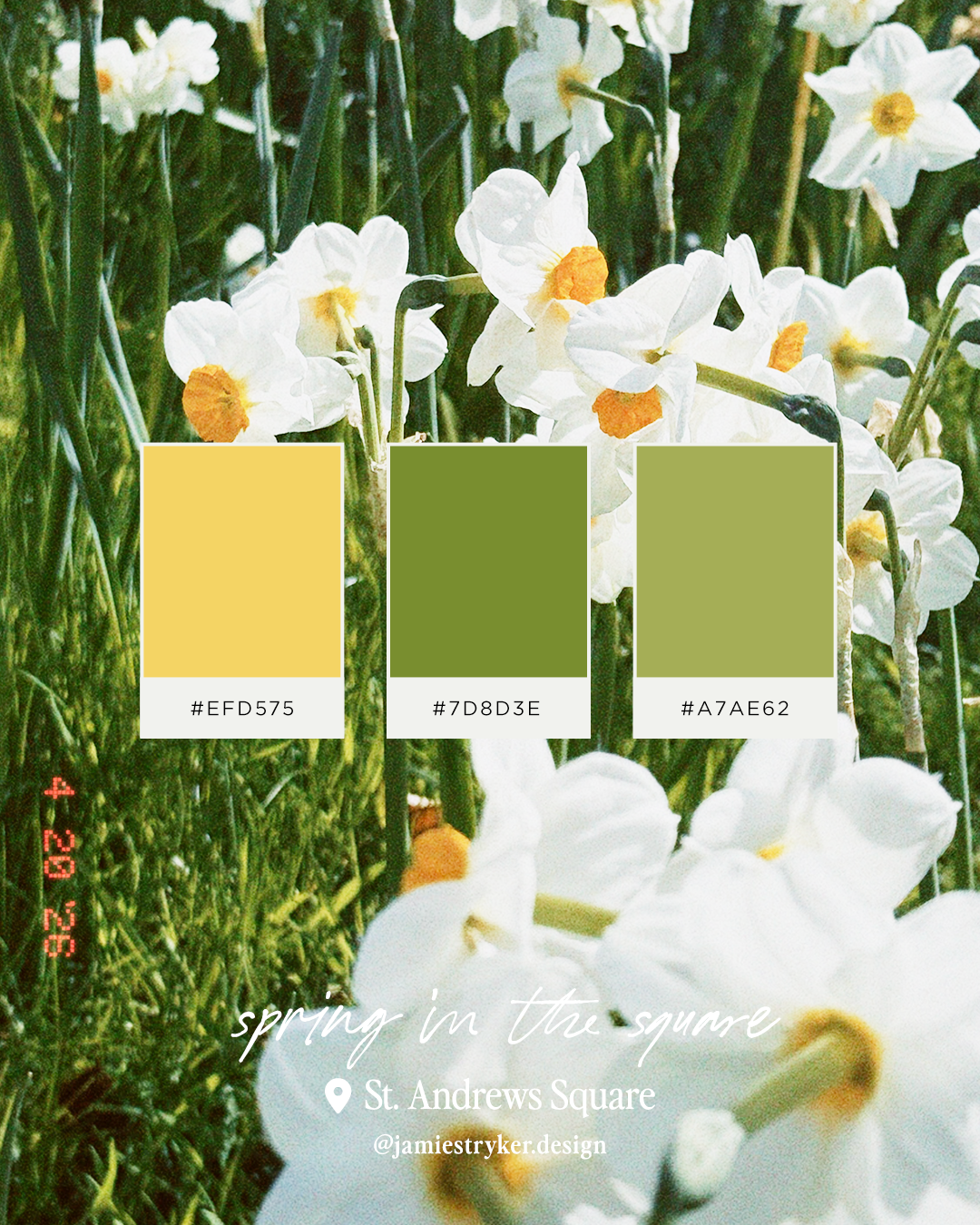
Spring in the Square
St Andrews Square